
So if you’ve been working with SharePoint Online for any length of time, you are used to views that show list data, but they don’t normally have any visual indicators that make important data stand out (unless you’re willing to dive into JSON formatting). However, now there are a number of out-of-the-box, menu-driven ways to make your important data stand out. Here’s some examples…
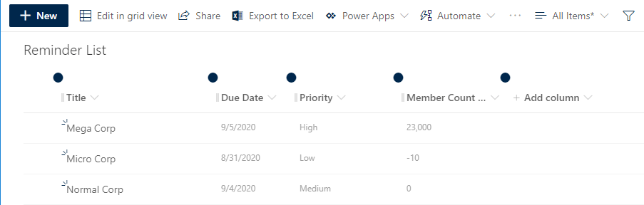
Here’s my example view as it appears with no formatting… looks pretty much like every other view you see on a daily basis:
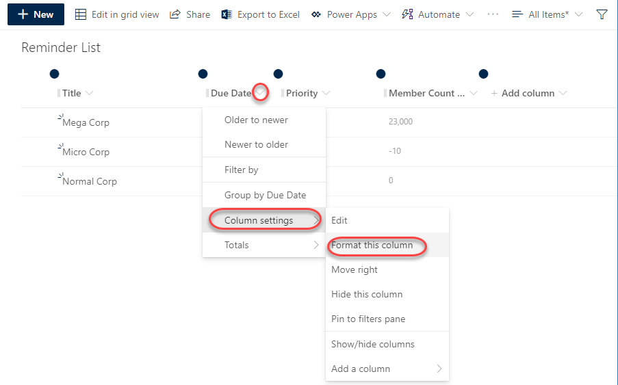
Let’s apply formatting to a date field column by clicking the drop-down arrow in the Due Date column, followed by Column Settings > Format this column:
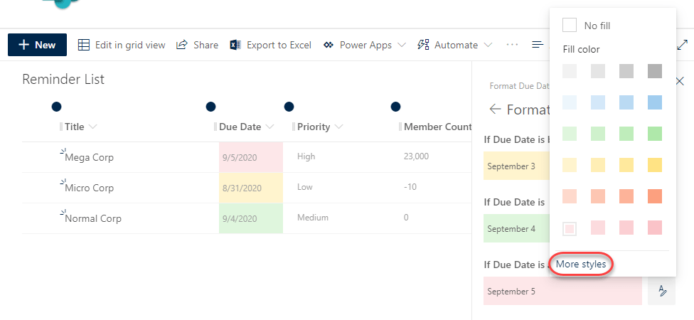
Selecting the Format dates option gives you basic colorization, but you can go further by clicking Edit styles:

You can customize your dates that fall before today, today, or after today by clicking on the Edit icon for that particular situation. Here I’m about to customize the Due Date values that are after today’s date:

I can change the color of those view cells, and I can click on More styles to add even more formatting:
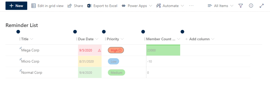
I’ve changed the text in those situations to red, added a warning icon to the cell, and placed the icon to the right of the value:

Now let’s change the formatting for a Choice field using the Choice pills format:
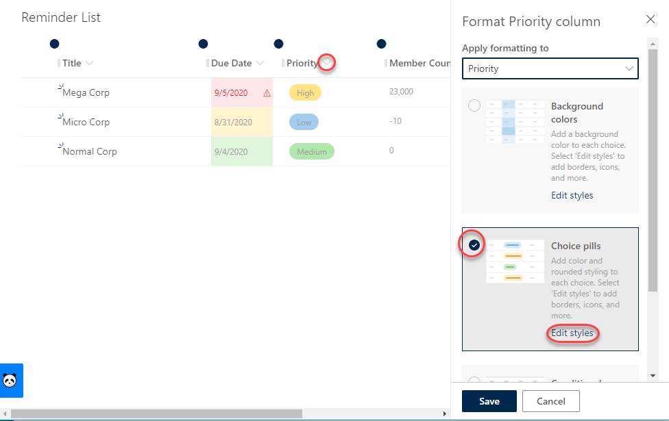
I’m going to update what the Choice pill looks like for a Priority value of High:

I changed the format to be a red pill, red text, and an exclamation icon that shows up after the High value:

Finally, I’ll format a field that is a numeric value using the Data bars option that does a color fill of the cell based on the value:

In this case, I’m filling the cell with green for positive values. If I had more data with positive values, you’d see that the length of the green fill area would be proportional to the maximum value found in that column:

And now you can see how I’ve added color and context to the data in the view in order to make it more visually appealing and informative:
Just a side note… “just because you can doesn’t mean you should.” In this case, I’ve probably gone overboard on colors and shapes just to show what’s possible. In reality, you should use things like this sparingly so that the person viewing the view doesn’t get overwhelmed with so many colors and shapes. In that case, it’s often more distracting than useful, and you lose any benefit of your formatting.

can you get more icons to use inside the Pills?
LikeLike