When looking at a SharePoint list earlier this week, I saw that Microsoft rolled out some changes to how a list and associated views are laid out on a page. Here’s the visual changes and what they do…
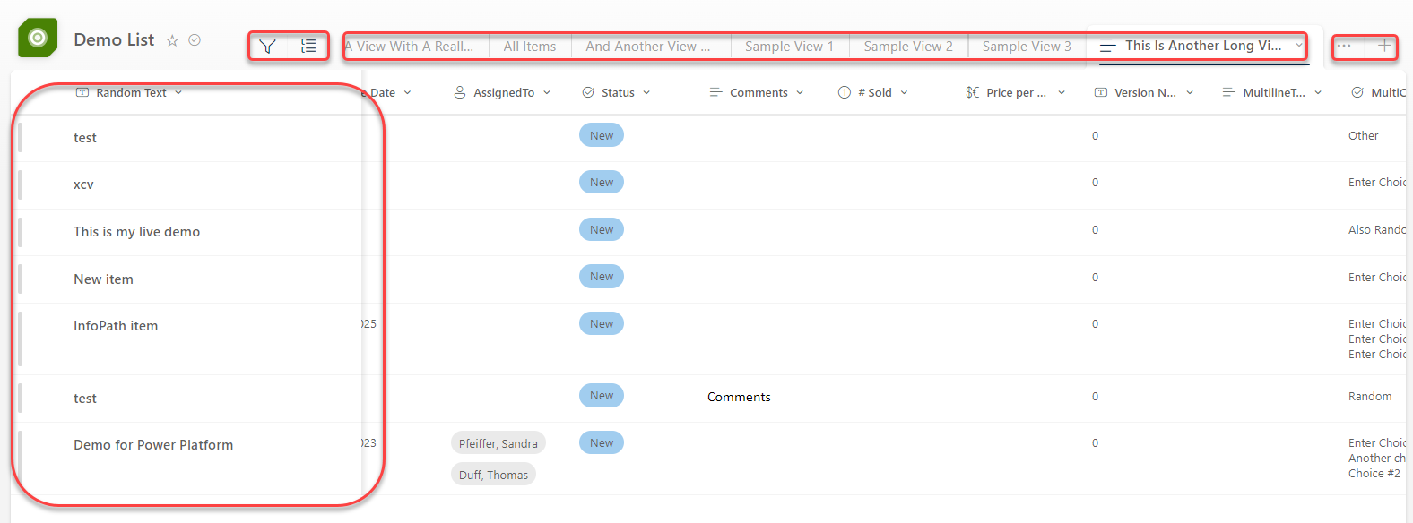
You will see a significant change across the top of the list… there’s now an icon associated with the list, and the views are laid out as tabs above the list. If you have more views than can be displayed across the top, you can click the ellipsis on the right side to get a list of additional views. If you want to create a new view, you can click on the Plus icon next to the ellipsis. To the left of the views, you’ll see the Funnel icon for filtering (it’ll launch a filter panel on the right side of the screen), as well as a Grouping icon to change the view to group content by one of the fields in the view. One of the more significant changes is that the first column is now “sticky”, so you will always have that column reference as you scroll to the left and right:

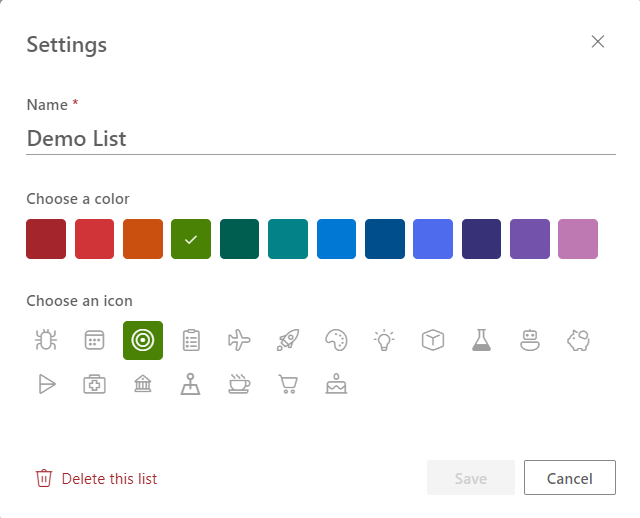
If you click on the icon next to the view name, you’ll see an Icon setting panel appear, where you can change the name of the list, as well as the color and icon associated with the list. You can even delete the list from here if you have that level of access:
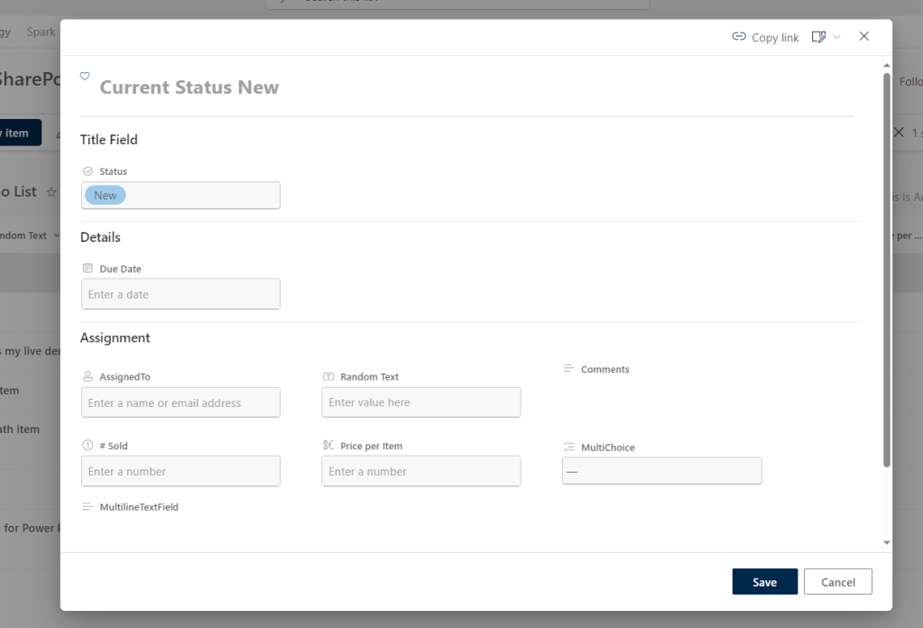
One other change is that when you open the item (provided it’s in a default SharePoint list form format), it’s no longer docked to the right side of the screen. It’s now in a panel that takes up the center of the screen:
I’m sure there’s more items I haven’t found yet, but I wanted to get this out so that you’re not quite as surprised as I was.

Thank you. Bute some options missing like to switch the view in gallery or compact list or list – seems so? its a bug?
LikeLike
How do I turn this OFF. I have views that I have created to allow PowerApps and PowerBI reports to bring in specific columns but don’t want those views visible to everyone.
Either turn it off entirely or select the views I do want people to see.
LikeLike
I need to know how to change this back immediately. This is catastrophic for our user group and can’t imagine why MSFT always breaks stuff like this. Any ideas?
LikeLike
I have two issues with this new version:
1. How can I control which view-tabs are shown
2. With JSON view formatter I show an image and when you click on it a new window opens. This worked before but now not anymore
Any idea is welcome 🙂
LikeLike
Your screenshot shows the three column view set with json worked in May but as of July 3 only one column shows and json is broken. If you still have the three column view with your sections when opening a list item I would be thrilled to hear how you did it.
LikeLike