
This is something I’ve been hoping and waiting for, and it’s finally out and available to most Office 365 subscription plans… the MyAnalytics Dashboard. This gives you a great overview of where you’re spending your time each week, as well as with whom. Here’s how it works…
To access your MyAnalytics Dashboard, go to https://myanalytics.microsoft.com/ and sign in with your Office 365 account. Your Home page of the Dashboard will give you an overall view of your Focus, Wellbeing, and Network analytics:
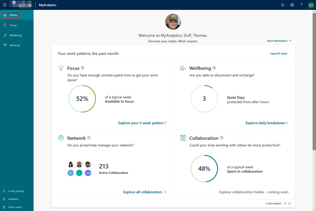
It will also give you some basic Productivity Insights, as well as suggestions on how you can improve in that area:


The Focus Analytics focus on how much uninterrupted time you have to get work done, and how you might want to set Focus time slots on your calendar:

The Wellbeing Analytics show how much (or how little) quiet time away from work you’re getting… and yes, I suck at this right now due to our SharePoint migration:

Finally, your Network Analytics show the number of people you collaborate with, who are the top people you interact with outside of normal work hours, and who you spend the most time with:
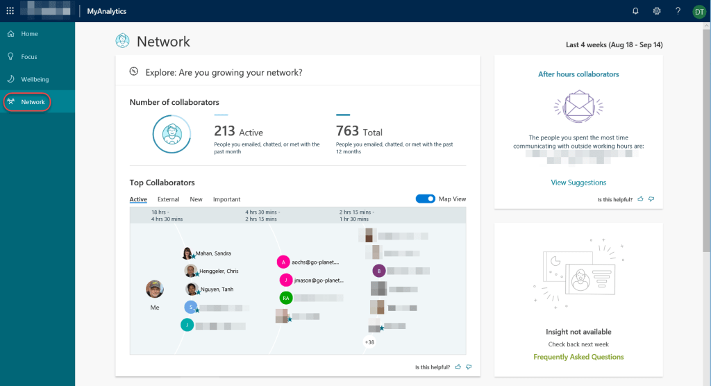
It also allows you to designate “important people” and shows how much time you’re interacting with them:

You can even get a weekly email synopsis of the prior week:

I *love* this feature, as it gives me solid evidence of where I’m spending my time, as well as how badly I’m currently doing in terms of shutting down from work on a regular basis. Once this SharePoint migration is done at the end of the year, I’m sure these numbers will improve… really…
