PivotTables and Charts are very useful in turning a large amount of Excel data into meaningful information that can be easily understood. But you might not have a clear idea as to what PivotTable or chart would be best for the data you have.
In Excel 2013, you can now let Excel recommend the best way to show the data.
With your spreadsheet open, go to the Insert tab and click Recommended PivotTables or Recommended Charts:

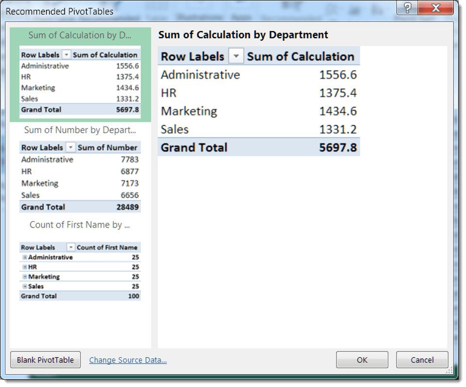
In my test spreadsheet, I have test data with names, dates, company, city, and other various data. When I click on Recommended PivotTables, I get a number of options that would make sense for this type of data:
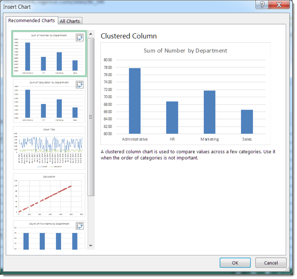
Likewise, clicking on Recommended Charts gives me some potential ideas for how I could chart this data:

When you click on the selected item and click OK, Excel will add that PivotTable or chart to your spreadsheet.
