
It’s been a long time since there’s been any significant changes to the user interface of a SharePoint document library. Microsoft decided to update the layout and make it a bit more “OneDrive-like” in terms of layout and filters. Here’s what it now looks like and how it works…
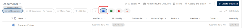
The most obvious change is the menu bar layout. They’ve changed how the views show up, added some filter buttons, and moved the list of actions. Also, the option to create or upload files and folders moved over to the right. First off, the views are now clickable buttons across the top:

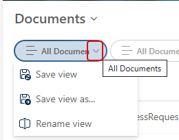
Each view has a dropdown arrow to save changes to the view, save a new version of the view, or rename the view:
To the right of the views, you have pre-defined filter buttons to quickly filter your view to show Word, Excel, PowerPoint, or PDF files:
You can also click on the Filter button to launch the Filters pane down the right-side of the screen:

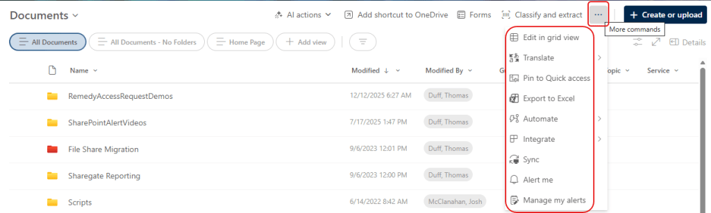
If you’re looking for the options like exporting the view or editing in grid view, click on the ellipsis in the menu bar. That will show you all the options you are used to using:
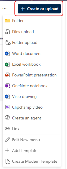
And finally, the Create/Upload option is over on the right-side of the screen:
Generally speaking, it’s a solid upgrade of the user interface, and brings it into the “modern” SharePoint world.
