By default, content in 2- and 3-column sections in a SharePoint page always put the content at the top of the section. This could lead to “less than appealing” page layouts if you had a larger image with just a small amount of text in the second column. You ended up with a lot of white space that couldn’t be used for anything. Now, you have the option to pick the alignment of content along the top, center, or bottom. Here’s how that works…
In this example, I have a two column layout that has an image web part in the first column and a text web part in the second column. By using the Alignment option in the second column, I can cause the single line of text in the text web part to be at top, middle, or bottom of the column, giving me options on how that text looks next to the picture:

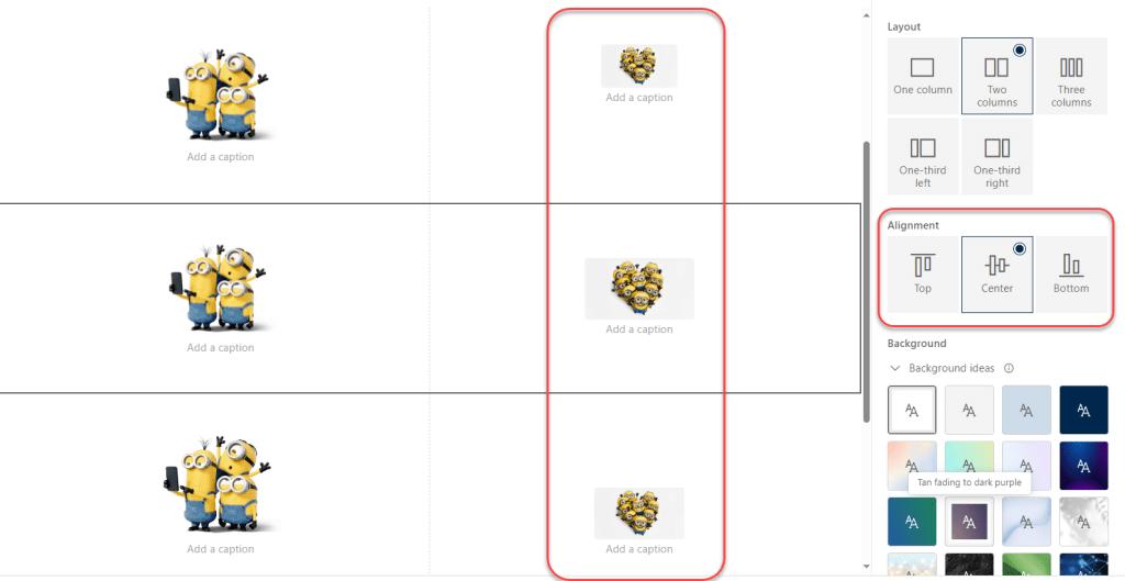
It works for any web part content in the second or third column, too. Here I have three images in image web parts in the second column, and I used the Alignment option to place it at the top, middle, and bottom of the section: